
The strongest 2027 entryway looks are statement lighting instead of recessed cans, a properly sized washable rug, closed storage, one large piece of art, and a bench with hooks. Martha Stewart’s designers say these fixes make an entry feel “warmer, more polished, and more put together.” Mudrooms, meanwhile, have gone from nice-to-have to standard, with color-drenched walls, ceiling-height built-ins and zones for every family member.

If the last few years treated the entry as a place to dump keys, 2027 treats it as a room. Hayley Chavez of HLC Studio told Martha Stewart: “It’s the first sentence of your home’s story. It sets the tone for everything that follows.” Trudy Stump of Huff Harrington adds that “a living room may be where guests gather, but the foyer creates anticipation and establishes the mood the moment someone walks through the door.”
This guide pulls those forecasts into one practical playbook. For every trend you will find what it is, why it is happening, how to do it in a real entry or mudroom, a budget angle, and the mistakes to avoid. At the end you will find a styling checklist, a budget guide and an FAQ.
The Big Picture: Why Entryways Are Changing in 2027
Three forces explain almost every trend below.
1. The entry is the first impression, and designers now treat it as a room. Google Trends data for the US over three months shows “common entryway decor mistakes” up 1,850% as a related search, “entry table decor ideas” up 80% and “foyer decor ideas” up 70%. Readers are searching for what to avoid as much as what to buy.
2. Mudrooms went from nice-to-have to standard. Chip Gruver, president of Gruver Cooley, told House Beautiful: “In our new construction projects, they have become the number one request; so much so that builders now treat it as a standard feature.” Homedit puts it this way: “In 2026, the mudroom is no longer a passive drop zone where coats collapse and shoes stack into chaos. It is a controlled architectural threshold that sets the tone for the entire home.”
3. Anti-showroom, pro-personality. Chavez warns: “When an entry looks like a photoshoot—where every object is placed just so, and nothing is out of place—it doesn’t feel like a home.” Designers want an entry that works hard, looks considered and still feels lived in.
Keep those three ideas in mind. When you are deciding whether a trend suits you, ask: does it make arrival smoother, more welcoming, or more personal? If it does none of those, skip it. The designers quoted here also disagree in places, for example on open cubbies and on plants by the door, and this guide flags those disagreements so you can choose.
Sculptural Statement Lighting

A flush or semi-flush fixture, pendant or lantern as the entry’s focal point. Laura Marion of Flight Architecture told Martha Stewart: “When you fill the ceiling with recessed lights (like Swiss cheese), you miss the opportunity to make a strong first impression.” She usually chooses “a flush mount that complements nearby lighting in the kitchen or dining area, but that still feels sculptural and intentional.”
Why it works: Deborah Shafier of Iguana Architects says “lighting is the perfect place to introduce luxurious materials like Murano glass, plaster, marble, linen, rattan, or metal finishes.” Wayfair’s Stephanie Mazzei says a dramatic chandelier or sculptural pendant “may seem like too much, but designers see it as a defining moment.”
- Match the nearby lighting. Marion’s rule for a cohesive home.
- Choose a textured material. Plaster, rattan or Murano glass.
- Keep recessed lights as a second layer. On a dimmer (writer’s tip).
- Mind the height. Leave clearance for tall guests and open doors.
- Think about the bulb. Warm white makes a first impression glow.
Budget options: A statement flush mount is the cheapest big swap. Renters can add a plug-in sconce (writer’s tip).
Mistakes to avoid: A recessed-only ceiling, and ornate fixtures with heavy scrolls or frosted glass, which Martha Stewart’s 2025 piece flagged as outdated.
A Properly Sized, Washable Rug


A rug sized to the entry, ideally low-pile or washable. Marion told Martha Stewart: “I didn’t have a rug in my tiled entry… But once I added a properly sized, flat-weave rug, the whole entry changed. It suddenly felt like a real room.”
Why it works: Shafier says: “Too small and it looks like a doormat; too large and it overwhelms the space,” and recommends “a low-pile or washable option, with 4 to 5 inches of floor around it.” Mazzei says designers love runners “for grounding the space, disguising everyday wear, and bringing warmth and personality to high-traffic areas.”
- Measure the floor. Leave 4 to 5 inches of floor showing around the rug.
- Test the door swing. Nancy Dow of Sierra Living Concepts warns a rug that is too large can overwhelm the space, and Martha Stewart adds you should make sure the door can open and close over it.
- Choose washable. Entry rugs take mud and salt.
- Pick pattern. Pattern disguises daily wear.
- Use a non-slip pad. For safety on hard floors (writer’s tip).
Budget options: HGTV’s mudroom roundup shows Ruggable and Target options, including a Ruggable Tess soft pink rug at $239 and a Cost Plus World Market reversible tile floor mat at $10.
Mistakes to avoid: A doormat-sized rug, or one that blocks the door.
Closed Storage (and the Cubby Debate)

Closed cabinets and consoles for the front entry, with function-heavy storage kept elsewhere. Shafier says to “be intentional with your furniture and built-ins” and to plan for “umbrellas, dog leads, reusable bags, and more,” preferring closed storage for a “clean and polished” look.
Why it works: Leslie Gregg of The Market at Grelen told Southern Living: “I am not a fan of shelving, bookcases, cubbies or other types of visual storage.” Peggy Haddad told Martha Stewart in 2025 that cubby benches “make the space feel chaotic—the opposite of what you want in a first impression.”
- Split the functions. A polished front entry with a closed console; heavy storage in a side mudroom.
- Plan categories. Umbrellas, leashes and bags each need a home.
- Use a chest as a console. The Spruce’s Lindsay Speace recommends an antique chest for day-to-day essentials.
- Hide the shoes. Closed cabinets beat open racks in a formal entry.
- Add one open shelf for display. Keep it edited (writer’s tip).
A counterpoint: House Beautiful quotes Ariel Okin saying open shelving can help, whether you have vintage baskets to show off or need motivation to stay organized. In a family mudroom, open shelving may suit you better than in a front foyer.
Budget options: A thrifted chest or dresser can serve as the console.
Mistakes to avoid: Open cubbies in a formal front entry, according to Gregg and Haddad.
One Large Piece of Art
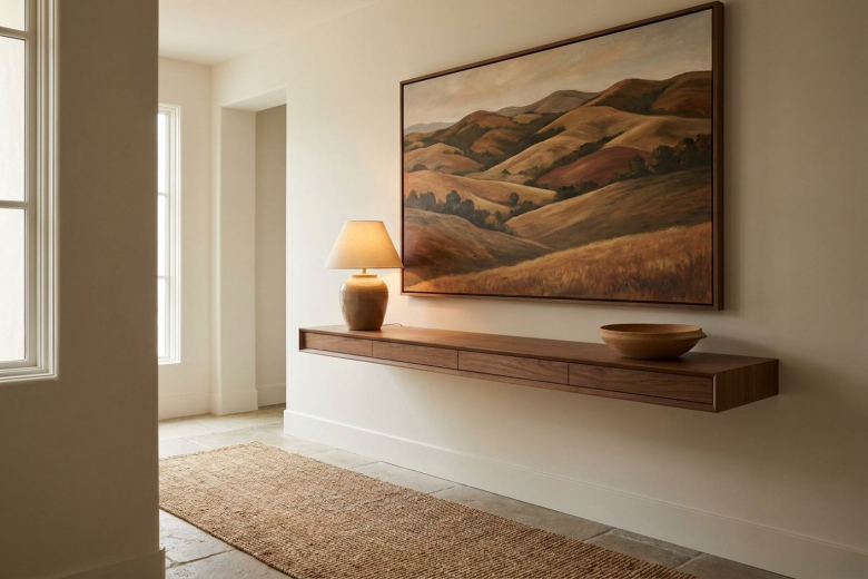
One big piece of art, or two stacked, in place of a cluster of small frames. Marion says: “One large piece, or even two smaller ones stacked, can send a clear message: ‘You’ve arrived.'” She suggests art “big enough to fill the wall, ideally from floor to ceiling.”
Why it works: Anne Underwood notes that “pieces need to be considered and edited,” and warns against cramming the walls. A single large piece gives guests a focal point on arrival.
- Go big. Size matters more than subject.
- Lean it. Terri Brien suggests leaning a landscape against the wall on a console and pairing it with a smaller abstract piece or a hand-drawn sketch.
- Stack two pieces. If the wall is tall and narrow.
- Light it. A lamp or picture light adds drama.
- Frame it well. A good frame makes a modest print look considered (writer’s tip).
Budget options: A large print, a thrifted canvas or a framed fabric piece.
Mistakes to avoid: Leaving walls bare, or crowding them with photos.
Bold Wallpaper in Small Foyers

Large-scale patterns in small spaces. Mazzei says designers “use large-scale patterns to create an unforgettable first impression… In smaller foyers, a statement print feels intentional and high-impact, instantly adding depth and personality.” Maggie Griffin of Maggie Griffin Design says: “Small spaces can pack a punch, especially with wallpaper… the most fun results are when you take chances!”
Why it works: The entry is a short visit, so a bold pattern is never tiring. HGTV’s Whitney McNell suggests “pulling a color from a wallpaper you love” for trim and cabinets rather than defaulting to generic white.
- Go large-scale. One big pattern reads better than lots of small ones.
- Pull a paint color from it. For trim or cabinets.
- Keep the rest simple. A plain console and a mirror.
- Try peel-and-stick. Google Trends lists “renter friendly wallpaper” as a top related query for renter-friendly decor.
- Frame the door. Pattern on the walls and a painted door looks designed (writer’s tip).
Budget options: Peel-and-stick wallpaper for renters.
Mistakes to avoid: Defaulting to a plain neutral right where you want impact.
A Bench, Hooks and Poufs

A seat and well-placed hooks that stop clutter from building up. Marion says: “A tasteful bench and some hooks go a long way. While art and lighting should take center stage, a small seat and well-placed hooks prevent clutter from building up.” For tight entries she suggests “one or two firm, cylindrical poufs,” and for roomier ones, “a vintage bench is ideal.”
Why it works: Shafier notes that “coat hooks are great for large, open entryways, but each should only hold one or two items… Overloading them instantly looks messy.” Beth Helmstetter says a settee or bench “should sit just outside the main pathway.”
- Keep seating off the path. Walk the route before placing furniture.
- Limit hook loads. One or two items per hook.
- Use poufs in small entries. They tuck away.
- Choose a vintage bench. It adds a collected feel.
- Add a tray beneath. For wet shoes (writer’s tip).
A counterpoint: Melanie Marshall told Southern Living that benches intended for seating “often become piled with pillows and miscellaneous items, causing them to lose their functionality.”
Budget options: A secondhand bench and a rail of hooks.
Mistakes to avoid: Seating in the main walkway, and benches that become dumping grounds.
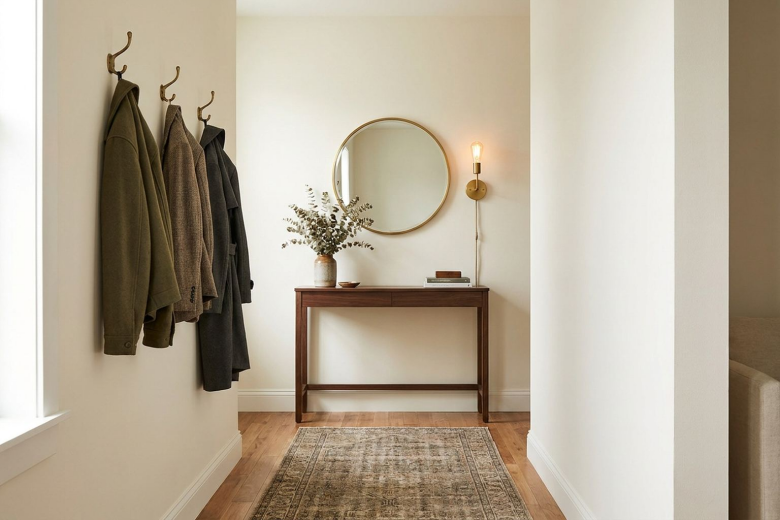
The Console, Mirror and Lamp Formula

A slim console with a mirror above and a lamp to the side. Gregg says: “You can never go wrong with a gorgeous mirror and a slim console table. Add a beautiful bowl for keys, a few framed family photos and a vase full of fresh flowers, and you end up with a simple, but elegant entry.”
Why it works: The formula is functional and polished. Cameron Johnson of Nickson Living recommends a table “narrow enough to fit adjacent to the front door” and a mirror at a height that lets most people see their faces.
- Choose a narrow table. It must not block traffic.
- Hang the mirror at face height. Too high or too low is awkward.
- Add a lamp. Warm light on arrival.
- Include a key bowl. One place for small items.
- Map the path first. Olivia Martin of Berberorugs says to “map out the walking path before buying anything.”
Budget options: HGTV’s entryway table roundup includes a vintage chest option and consoles from $1,449 (Birch Lane Isabel at Wayfair). A secondhand table costs far less.
Mistakes to avoid: A console too deep for a narrow hall, which Dow says can dominate the space.
“Ugly-Chic” Workhorses

Statement hooks, baskets, umbrella stands and mail sorters. Evelina Juzėnaitė of Planner 5D told Martha Stewart: “We love beautiful and unusual hooks. They give a small room an interesting atmosphere.” She recommends “fewer baskets, rather than many small ones.”
Why it works: Mazzei says that when not in use, “a sculptural or vintage-inspired stand acts as an intentional accent piece, adding charm and character instead of clutter.” On umbrella stands, Juzėnaitė notes: “When rainy days come, you need somewhere to put your umbrella.”
- Choose unusual hooks. They become wall decor.
- Use one big basket. It hides keys, shoes, umbrellas and bags.
- Add an umbrella stand. A sculptural one is a feature.
- Mount a mail sorter. It keeps the console clear.
- Edit. Fewer, better objects.
Budget options: Thrifted baskets and a vintage-style stand.
Mistakes to avoid: Many small baskets.
Color-Drenched Mudrooms

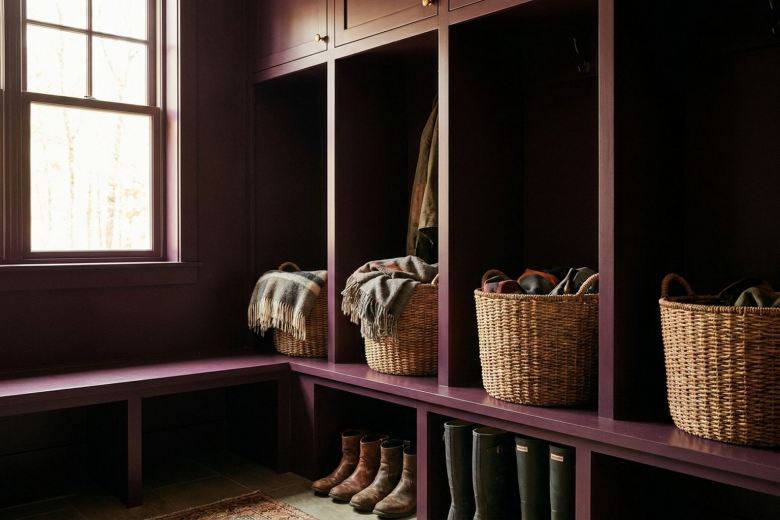
Painting walls, trim, doors and cabinets in one bold color. HGTV’s Emily Tucker says: “I love a bold color in a heavily used space that you don’t spend a lot of time in.” Naomi Stein, on a dusty peach-pink entry, says: “Painting the trim, the doors and the wall paneling one color helps create consistency, to soften the bold floor tile pattern. Plus white cabinets in a mudroom get dirty really fast. Color takes a beating a little better!”
Why it works: Homedit notes that “deep saturated paint absorbs shadow and dirt.” House Beautiful features Jennifer Hunter’s mudroom, color-drenched in Farrow & Ball’s Brinjal for a dramatic dose of contrast.
- Start with walls and trim. Max Humphrey suggests this as an entry point.
- Choose a scrubbable finish. Satin or semi-gloss (writer’s tip).
- Include cabinets. One color makes it look intentional.
- Balance with the floor. A bold floor pairs with a single wall color.
- Add warm light. Dark colors need it.
Budget options: Paint is the cheapest way to transform a mudroom.
Mistakes to avoid: All-white cabinetry in a muddy mudroom.
Mudroom as Architecture
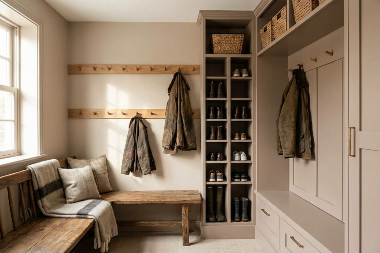
Ceiling-height built-ins and zoning. Homedit says: “Vertical grids isolate footwear… Custom casework climbs to the ceiling to extract wasted volume. Benches conceal massive storage beneath clean horizontal lines.”
Why it works: Gruver’s “number one request” quote shows demand. House Beautiful highlights Heidi Lachapelle’s built-in bench with slim drawers for stashing everything from gloves to dog leashes.
- Go to the ceiling. Use the vertical space.
- Hang hooks at two heights. Adults and kids.
- Choose a bench with drawers. Hidden storage.
- Zone by person or function. Shoes, bags, pets.
- Avoid loose racks. Homedit lists them as a weakness.
Budget options: Stock cabinets with a custom-painted finish (writer’s tip).
Mistakes to avoid: Loose open racks that collapse into chaos.
Flexible Furniture-Based Mudrooms
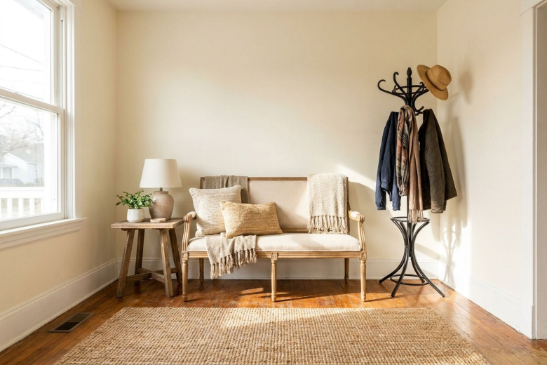
Furnishing a mudroom with movable pieces. House Beautiful quotes Kate Marker: “For renters or those opposed to a wall of built-ins, furnish your mudroom like you would any other space, with flexible furniture… a comfortable bench, side table, and coatrack… instead of the traditional wall of shelves or hooks.”
Why it works: Google Trends lists “renter friendly wall decor” as the top related query for “renter friendly decor.” Furniture moves when you do.
- Start with a bench. Add a side table and a coat rack.
- Use baskets. One per person.
- Add a rug. Washable.
- Hang a mirror. For the last-second check.
- Accept a rack if you must. Gregg dislikes freestanding stands but concedes a rack “might be a necessity in a small entryway without a coat closet.”
Budget options: Secondhand furniture and a wall-mounted rail.
Mistakes to avoid: Overfilling a small space.
Zones for Every Family Member

Hooks, drawers and baskets for each person and pet. House Beautiful notes that Claire Stazak used hooks, drawers, shelves and baskets so each person can stay organized “in their own way,” and Kemble Interiors gave hats a wall of hooks.
Why it works: Marshall’s rule is “don’t put it down, put it away”: always hang your coat up, put keys in a basket and store shoes in actual storage.
- Give each person a zone. Hooks, a basket and a drawer.
- Plan for pets. Leashes, towels and bowls.
- Add a wall of hooks for hats.
- Include a drop zone for keys.
- Plan categories. Shafier’s list: umbrellas, leads, bags.
Budget options: Individual baskets and a row of hooks.
Mistakes to avoid: One-size storage that suits nobody.
Branches, Flowers and the Plants Debate

Tall branches or flowers on the console. Mazzei says bare branches “styled in a tall vase on a console, they add height, texture, and quiet drama without visual clutter.” The Spruce suggests found branches from your backyard “for a budget-friendly and sustainable decor accent that won’t wilt.”
Why it works: Martha Stewart’s 2025 article says faux greenery “collects dust” and lacks the movement and authenticity of real branches. Nicole Zarr takes the opposite view for plants: “Please, no plants in an entryway, unless you are in a coastal home.”
- Forage. Free branches from your yard.
- Choose a tall vase. Height without clutter.
- Replace seasonally. Fresh flowers weekly.
- Skip faux greenery. Per Martha Stewart.
- Decide about plants. Designers disagree; light and space decide.
Budget options: Foraged branches are free.
Mistakes to avoid: Dusty faux greenery.
Vintage and Antique Anchors

Chests, benches and frames with age. Mazzei says designers use vintage frames “to add depth and a collected feel that keeps an entryway from looking flat or predictable.” HGTV’s entryway table list includes “Charm With a Chest” and a burlwood pedestal table. Homes & Gardens’ 2027 report describes “found luxury” as prioritizing pieces with history, character and personal meaning.
Why it works: An old piece brings a story at the door, which fits the anti-showroom mood.
- Use a chest as a console. Storage with character.
- Add a vintage bench. Marion’s pick for roomier entries.
- Frame art in old frames.
- Mix with modern. One antique per new piece.
- Thrift. Estate sales and secondhand shops.
Budget options: A thrift-store chest or bench.
Mistakes to avoid: Overfilling with antiques.
What Is Going Out in 2027
| Fading | Replacing it |
| Recessed-only ceilings | Sculptural statement lighting |
| Cubby benches in formal entries | Closed consoles and cabinets |
| Showroom-perfect styling | Lived-in, personal entries |
| Ornate scrolled or frosted fixtures | Clean pendants and textured materials |
| Decorative signs and quote art | One large piece of art |
| Freestanding coat racks | Hooks, benches and built-ins |
| Tiny doormat rugs | Properly sized washable runners |
| Faux greenery | Real branches and flowers |
How to Combine Trends Without Making a Mess
Mixing six trends in one small entry can quickly feel chaotic. Use these rules.
Rule 1: Pick one hero and two supports. For example, statement lighting (hero), a large piece of art (support) and a bench with hooks (support).
Rule 2: Keep a 60-30-10 color split. Sixty percent dominant color (walls and floor), 30% secondary (furniture and rug), 10% accent (art, objects, flowers).
Rule 3: Repeat materials in threes. If you use brass, echo it in a hook, a lamp base and a frame.
Rule 4: Mix eras. Pair one vintage piece with each new piece.
Rule 5: Give the eye a rest. Bold wallpaper needs plain furniture.
Rule 6: Edit at the end. Remove one object from every surface. Ashley Gallion of Ashley Ayer Interiors goes further on seasonal decor: “The entryway is not a place for seasonal decor… Put a wreath on the front door, and call it a day.”
Three Sample Combinations
- The Polished Welcome: a sculptural flush mount, a slim console, a mirror, a lamp and one large piece of art.
- The Busy Family Mudroom: a color-drenched bench wall, hooks at two heights, a washable runner and closed drawers.
- The Collected Foyer: an antique chest, a vintage frame, bare branches and a patterned runner.
The Entryway Mistakes Designers Keep Flagging
Because “common entryway decor mistakes” is one of the fastest-rising related searches in the US, it is worth collecting the errors designers name most often in one place. Each of these is drawn from the designers quoted above, and each has a simple fix.
- A ceiling full of recessed lights. Marion says it wastes the chance to make a strong first impression. Fix it by adding one sculptural fixture that matches the lighting in the next room.
- A rug that is too small or too big. Shafier compares the small version to a doormat and the large one to something that overwhelms the space. Fix it by leaving 4 to 5 inches of visible floor and checking that the door still opens.
- A console in the traffic path. Dow calls this the most common layout mistake, and Martin recommends mapping the walking path before buying anything. Fix it by choosing a narrower table or moving it to the wall that is not on the route.
- Overloaded hooks. Shafier says each hook should hold only one or two items. Fix it by adding more hooks at two heights, not by stacking coats.
- A mirror at the wrong height. Johnson warns that a mirror hung too low or too high leads to “an immediately awkward interaction.” Fix it by hanging it so most people can see their faces.
- Too many small baskets and too many photos. Juzėnaitė recommends fewer, larger baskets, and Underwood says not to cram the walls. Fix it by editing down to one big basket and one large piece of art.
- A bench that becomes a pile. Marshall says benches intended for seating often lose their function under pillows and miscellany. Fix it by adding hooks and a closed cabinet so the bench stays clear.
- Showroom styling. Chavez says an entry where nothing is out of place does not feel like a home. Fix it by leaving one lived-in element visible, such as a favorite pair of boots on a tray.
If you only fix two things this weekend, make them the lighting and the rug. Martha Stewart’s designers say those two changes alone are the fastest way to make an entry feel warmer and more polished.
Budget Guide
| Budget | Where to spend | Where to save |
| Under $150 | A washable rug ($10 mat to $239 runner), hooks, a basket, paint | Everything else: use what you own |
| $150 to $600 | A statement flush mount, a mirror, a lamp, a thrifted chest or bench | Keep existing flooring and walls |
| $600 to $2,500 | A console, wallpaper, a large piece of art, a closed cabinet | Mix in secondhand pieces |
| $2,500+ | Custom built-ins, a color-drenched mudroom, a statement fixture | Accessories can wait and be collected over time |
Smart buying tips:
- Spend most on what you use daily (a bench, hooks, a durable rug) and on what is hard to change (lighting, built-ins).
- Measure the door swing and walking path before buying anything.
- Vintage and secondhand pieces give the collected look authentically and cost less.
Step-by-Step 2027 Entry Refresh
- Define how you use the entry. Who comes in, what they carry and how often.
- Choose your mood words. Three words, such as “warm, tidy, personal.”
- Map the walking path. Keep it clear.
- Pick the hero. Lighting, art or color.
- Decide the palette. Use the 60-30-10 ratio.
- Paint. Test samples on two walls.
- Add the big pieces. Console or bench, rug and storage.
- Layer lighting. A fixture plus a lamp.
- Add objects. Mirror, bowl, branches.
- Edit. Live with it for two weeks and adjust.
Styling the Trends by Entry Size and Layout
Trends behave differently depending on the space you have. Here is how to adapt the ideas above.
Small Entries (under 40 sq ft)
- Choose one hero. A single statement light or one large mirror.
- Use poufs. They tuck away.
- Go narrow. A console slim enough to sit beside the door.
- Try bold wallpaper. Small spaces can take it.
- Embrace open space. Designer Rebekah Leal says it is a transitional space, not necessarily a room that needs to be filled.
Open-Plan Homes
- Define the entry with a rug. A runner marks the zone.
- Match the lighting. Marion matches the flush mount to nearby lighting.
- Use a console as a divider. A slim one behind the sofa.
- Keep sightlines calm. The entry is seen from the living room.
Large Foyers
- Add a statement piece. A big chandelier or pendant.
- Create a seating moment. A vintage bench or settee.
- Scale up the art. One very large piece.
- Use a round table. A center table suits large foyers.
Rentals and Temporary Homes
- Use furniture, not built-ins. Marker’s flexible approach.
- Add plug-in sconces. No wiring.
- Use peel-and-stick wallpaper. Removable.
- Rely on rugs and baskets. They move with you.
FAQ
- What is the biggest entryway trend for 2027? Treating the entry like a room: statement lighting, a good rug, closed storage and one large piece of art.
- How big should an entryway rug be? Shafier recommends a low-pile or washable rug with 4 to 5 inches of floor around it.
- Are cubby benches out? Some designers say they feel chaotic in a formal entry, while others like open shelving in a family mudroom.
- Should I put plants in my entryway? Designers disagree. One says no plants unless you are in a coastal home; another recommends bare branches.
- What color should a mudroom be? Designers recommend bold, scrubbable color because it hides wear better than white.
- How do I make a small entryway feel bigger? Use a narrow console, a mirror at face height, wall hooks and a single hero piece.
- Should I decorate my entry for the seasons? One designer says to put a wreath on the door and call it a day, though search interest in seasonal entry decor is high.
- How do I avoid clutter by the door? Use a bench and hooks, give each family member a zone and put things away instead of down.
Final Thoughts / Thumbnail:
The 2027 entry is not about buying a new look. It is about building a threshold that welcomes you home, works hard for your family and gets better with age. Start with the trend that feels most like you, whether that is a sculptural light, a washable runner or a color-drenched mudroom, and build outwards slowly.
